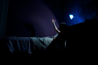
So first of all, here's the final image:
The product of an overactive imagination
Scary enough? :P
Ok, how did I do it? How did I get those shadows on the wall when the light source is behind me, and how did I get that ominous green hand trying to wrench my blanket away while I was still on the bed?
Well, I live in a really old house, so I asked the monsters nicely if they'd help me out and they agreed they'd do a bit of modelling if I ordered them a pizza. Deal!
Oh alright, not really. All you need is to know how to use layers, layer masks, and the brush tool in Photoshop, and have a few photographs to hand. A tripod or other solid surface helps, and a way of taking the photos while you're in front of the camera (I used my tripod, worked tethered to my computer which is out of the shot, and my wireless remote trigger). It's pretty important that the camera doesn't move while you take all your images, or you're going to make things very difficult for yourself when it comes to stitching it all together. First of all, here's some of the images I used for the final image (I used 8 images in total).
There's a few other shadow images but you get the idea. After that it was just a matter of overlaying the shadow images on top of the image of me curled up in a corner, adding "hide all" masks to the shadow images and using a large soft brush to reveal the shadows on the wall and the hand on the blanket. The green skin colour was just adding a black and white adjustment layer, inverting it with cmd+i, and again revealing the black and white tones with a brush, though this time with a smaller and harder one. Then it was just a matter of choosing the shade of green as a tint. Finally, I altered the tones and colours of the overall image and voilà, one scary monster picture :D
I got into a bit of a funny mood by the end of it though, and started to get silly...
On a more serious note, as you can see in all of these photos, my only light source was the desk lamp on my bedside table. That's it. No flash was used. I did experiment with the flash a little however:
Go into the light my children!
Too red
D:
For the first image, I decided it was too bright. The light bounced around too much and there just wasn't any point in me using the flash down there like that. But what about a coloured flash? I grabbed a red t-shirt and wrapped it around the flash a few times (very high tech as you can see). It fired (after fighting with it for a little while, it's a little temperamental so I'm getting a new one soon) and it clearly didn't work. So I gave up on that idea. I turned the trigger on the flash off and put it out of the frame. Weirdly though, while I was doing one of the hand-under-the-bed shots, the flash decided to go off on its own volition. Me being under the bed at the time, and in a bit of a strange mood, felt slightly weirded out by this and in the end decided to ignore it. Like I said, the flash is a bit strange (and senile I'm guessing. It tries though.) I took a few more photos just to see if it would do it again, but it didn't. Creepy!
So there we have it. That's how I made my composite monster image. And if you're wondering what those white things on my fingers are in some shots, they're paper claws. Click here and watch the same video I did to learn how to make them. They are truly awesome.
Have fun!


No comments:
Post a Comment